Five key factors for building killer IoT visualizations and reports

IoT is one of the most talked about digital transformation initiatives impacting industrial enterprises today. Its ability to significantly improve decision-making has exceeded expectations. In fact, we recently found (note: registration required) 95% believe IoT has a significant or tremendous impact on their industry at a global level, and 73% plan to increase their investments over the next 12 months. But without killer reporting and visualization tools, this transformative experience wouldn’t be possible. Teams would drown in their data, miss critical insights and more. So one caveat I always share with businesses new to IoT is to start planning out the reports and visuals they anticipate carrying the most meaning for the business early in the process. Waiting until the last minute could result in frustration or missing the business objective all together.
To avoid unfavorable results, here are five key factors to consider when building reports and visualizations that make it easy to understand what you — and your peers — want to learn from your connected enterprise.
#1. Pinpoint what needs to be communicated. IoT deployments collect more data than can possibly be utilized. You don’t have to look at it all either; you can prioritize data based on your particular business objective(s). Matching the output report to your initial goal, such as improve asset uptime or reduce costs, is critical in extracting the most value from your data. Anything else can be a distraction. So, ask your stakeholders what a) they want to learn from the data, and b) what decisions they want to make from it. Incorporating only those data sets that align with the desired outcome can help you achieve success.
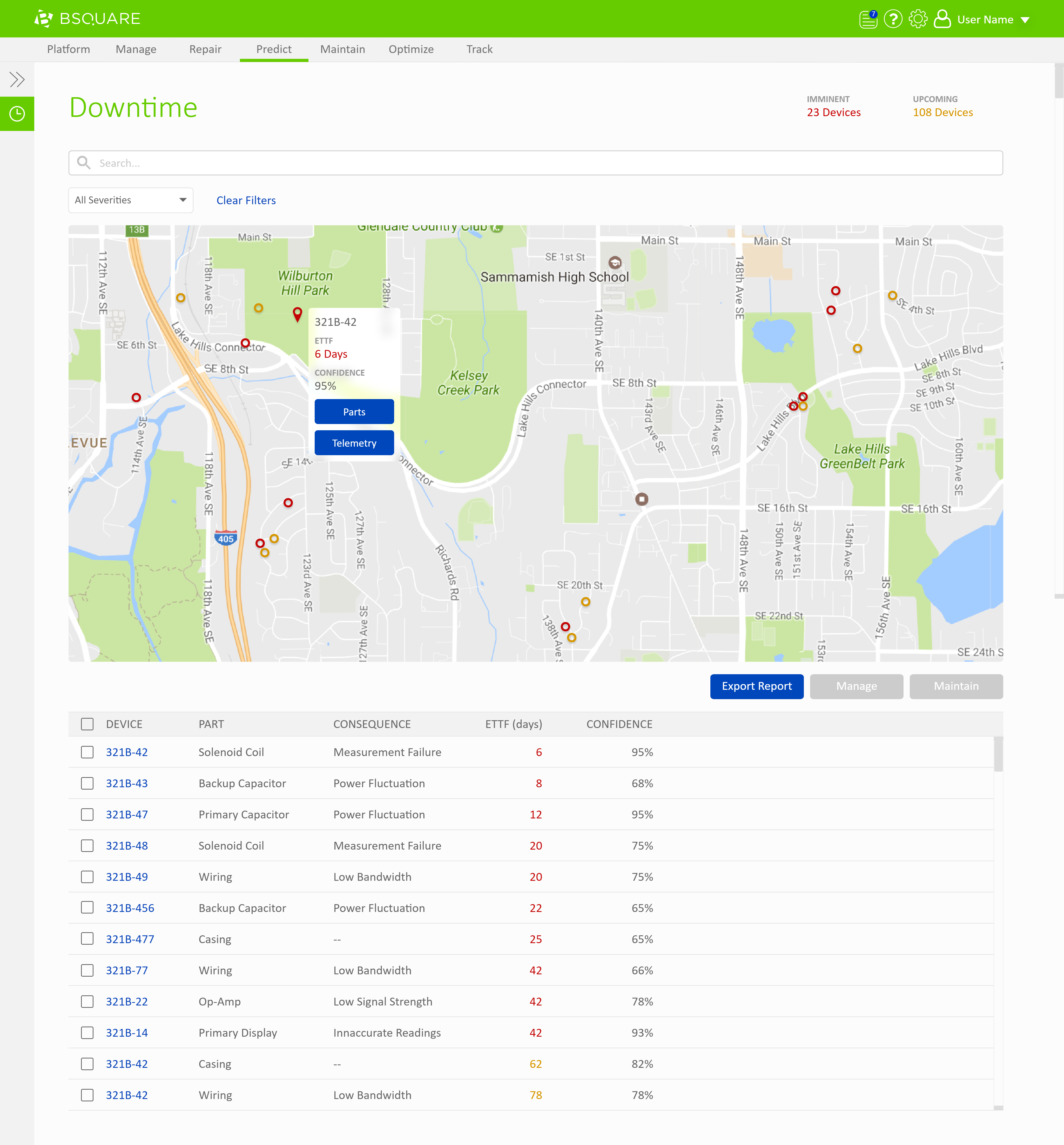
This report on downtime helps an asset manager determine the estimated time to failure as well as identify the affected component.
#2. Choose the right reporting style for your audience (and there will be more than one). There is a plethora of reporting options available natively in most platforms or applications. With some customization, you should be able to get up and running quickly. The reporting style preferences will vary depending on the audience. For example, dashboards and email alerts may be more fitting for the day-to-day needs of asset managers whereas less frequent, higher level reporting may be preferred across the C-suite.
But, be warned that complex representations of data can easily lead to confusion. Which I’ll go into next.
#3. Edit the story. Simplicity is the key to effective data visualization. However, it is very easy to create chaos in reports by underestimating the complexity of your assets and their associated variables.
Let’s consider a simple example from the transportation industry. For a semi-trailer rig, how is fuel consumption (ex., mileage) related to engine horsepower? Generally, you can picture what the relationship would look like — as engine horsepower goes up, so too would the consumption of fuel (i.e., a positive correlation between a single independent and dependent variable).
Now let’s make this simple example more complex: How would you visualize the relationship between fuel consumption, type of route traveled (in-city, long haul, short haul), engine horsepower, truck configuration, time of day and driver experience level, all in the same visual — that’s not easy. But, each of these variables could be analyzed and characterized separately in a very meaningful way.
So, when the usage scenario is complex, the best approach is to break the problem into multiple layers of analysis, each with a simple two or three variable maximum.
#4. Consider enterprise data integrations. Cross-system reports can extend the value teams can get out of IIoT data sets. IoT applications can plug into popular reporting platforms, such as Amazon QuickSight, Power BI from Microsoft and Tableau. Here, asset managers can connect IoT asset information with other enterprise system data to create new data views that can be critical for business success.
For example, a quick-serve restaurant may want to forecast food demand in order to reduce inventory costs and waste. Sensors in entryways and the parking lot provide part of the picture, but it’s also necessary to tie that to historical point-of-sale data, as well as weather and traffic information. This additional context improves the accuracy of the predictions.
#5. Set best practices. Because a variety of teams may need to communicate IoT data to the same audiences, it’s important to set templates where possible so reporting is streamlined and cohesive. Publishing to a shared location with templates will help save teams time and allow them to standardize on what works well.
Regular tweaking of reports will also be required to keep aligned with your maturing IIoT deployment. Some other tips for creating compelling visuals include: orient text horizontally, clearly label data and use some color (but not too much color). The key is to let the visual do the talking. If you’re finding that you need to explain every detail, it’s time to fine-tune.
Effective reporting is one of the biggest drivers behind IIoT maturity. It enables industrial organizations to build on success and quickly spot and fix issues. As a result, businesses are able to reach the latter stages of IIoT maturity — analytics, orchestration and true edge computing — faster. It is also essential for getting the broad number of stakeholders involved in an IIoT deployment on the same page to ensure maximum value from your investments.
All IoT Agenda network contributors are responsible for the content and accuracy of their posts. Opinions are of the writers and do not necessarily convey the thoughts of IoT Agenda.